Richard Halstead’s Article “Drawing: The Intimate Art” Will be Appearing in the September Issue of Fine Art Connoisseur Magazine
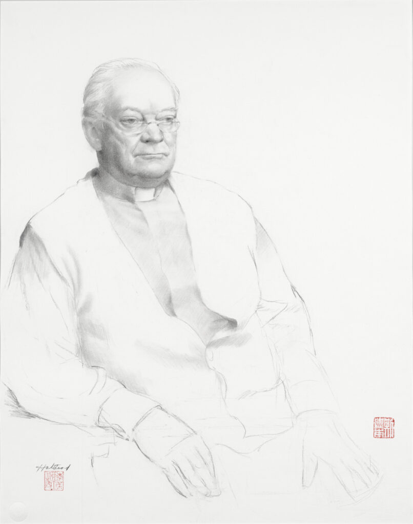
The following paragraph is a preview of a new essay that I intend to have published in the not too distant future. This one is about drawing: the most essential element in most works of visual art. However, drawing is typically undervalued aesthetically and monetarily, often thought of as the ‘poor cousin’ of painting. This essay, which includes a very brief history of drawing from renaissance to the present, gives a sense of the multiple dimensions of drawings and the drawing experience. Here is an excerpt from that essay:
“Though drawing attained a new appreciation in the eighteenth century it continued, throughout those times and to this day, to be essentially a tool for study. As with avid naturalists, drawers are typically absorbed with the intricate nuances found through their studies. It is love of life from the root up. It is a poetic expression that comes from a sense that the world is too vast to ever be known in total, and a belief that its heart can best be known while we are on our knees studying the individual, the lichen at the root of a tree, the incomparable grace of a model’s sinewy thigh, the feeling of a bird’s movements, or the compelling mystery of a boney but softly animated human face. Drawing then is very different from painting, which is often thought of as the pinnacle of visual art and generally takes in a whole scene, giving a sense of completeness or of a grand scheme.”
Look for the article in the upcoming issue of Fine Art Connoisseur Magazine.
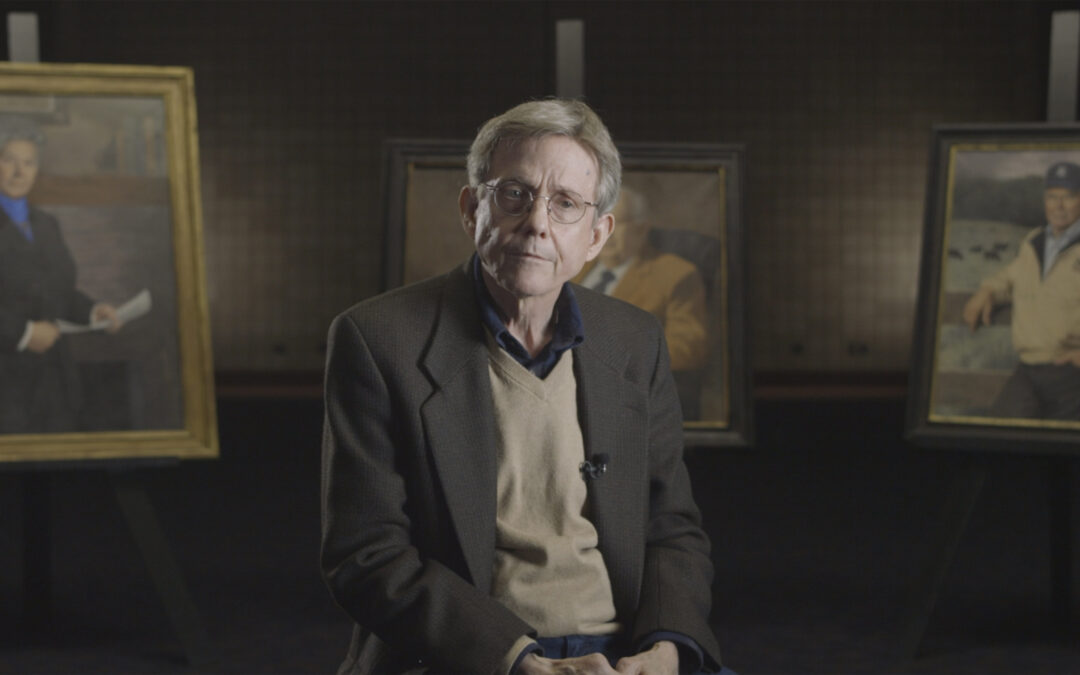
“The Art of Greatness”: Richard Halstead Interview featured in Video
Five Portraits
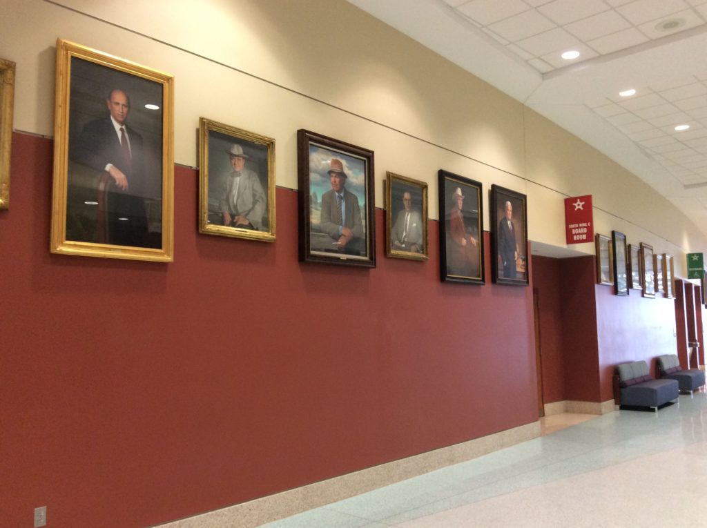
In 2018 Josh Comninellis, video production director of the American Angus Association, asked me to participate in a video that he and his team (Max Stewart and Ali Luety) were making about five people who were recognized as being very important, in a variety of ways, to the development of the Angus cattle breed. In character and accomplishments the five people differed in very significant ways, but there was a common thread in that each had been honored by having a portrait of themselves included in the prestigious Saddle and Sirloin Club headquartered in Louisville, KY. My connection to the five was that I was the artist commissioned to paint all of these portraits.
As part of the presentation I was to be interviewed to give my perceptions of these special livestock leaders, having come to know them in the process of painting their portraits. However as the project evolved my words played a major part in the narration and my involvement as the portraitist was used as the connecting link in telling their stories.
Even if you have never been curious about the livestock industry, you may find this video interesting simply because of the uniqueness of each personality and the experiences, passion and approaches each person profiled brought to their profession. As an artist I find it essential to understand those dimensions in order to create a satisfying portrait. So the video may also give you some insight into my thinking in approaching a portrait commission — the individual characters of the subjects, their lives, their achievements and the things that have motivated them are always my basis and inspiration.
Preserving a Legacy: Conserving a Portrait of Marshall Field II
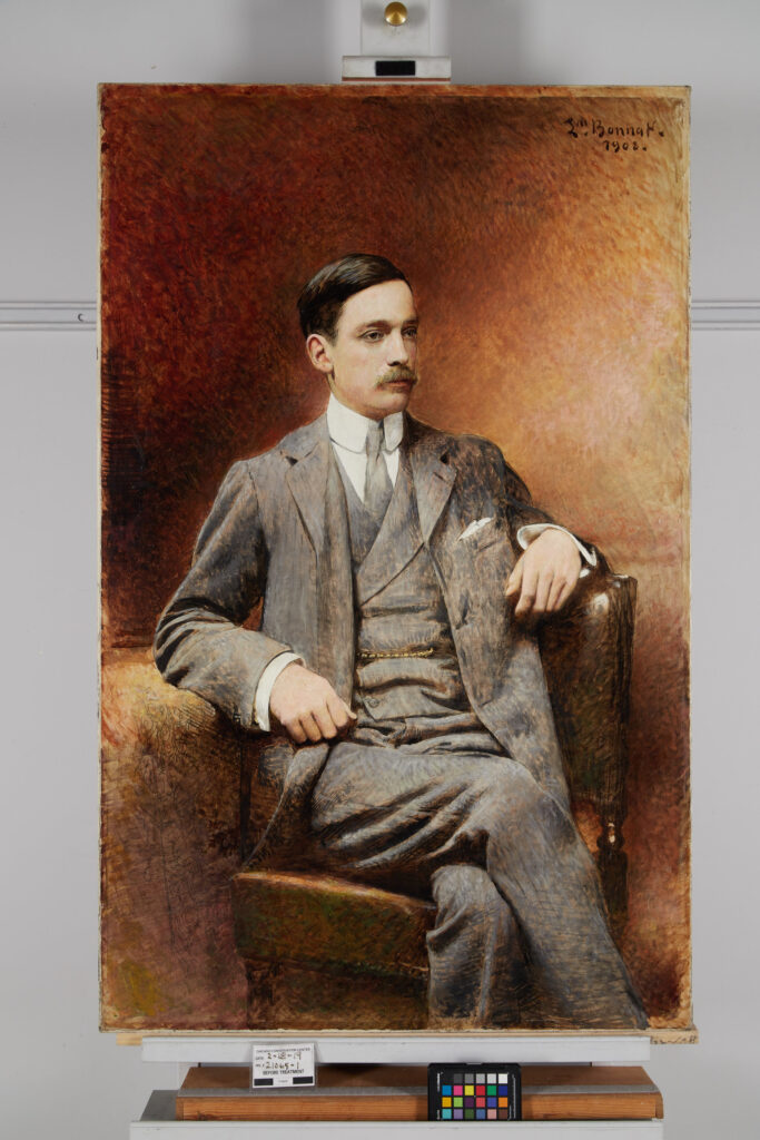
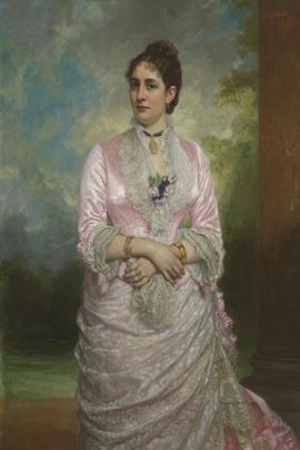
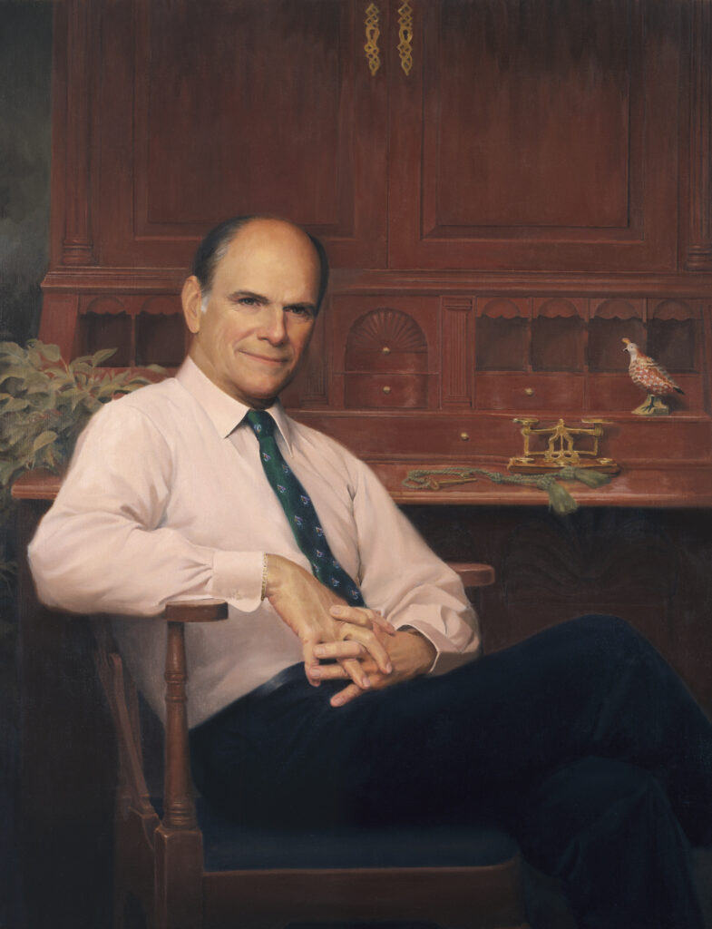
This is an interesting article about the Chicago Conservation Center’s work on a portrait of Marshall Field II by Leon Bonnat, a very successful 19th century French portrait artist (image above) at the Chicago Conservation Center where it was being cleaned and repaired. The article talks about portraits of the different generations of Marshall Fields including my portrait Marshall Field V, former chairman of the Art Institute of Chicago. To read the article “Preserving a Legacy: Conserving a Portrait of Marshall Field II” by The Conservation Center, click here.
The Story Behind Marshall Field’s Portraits, Then and Now
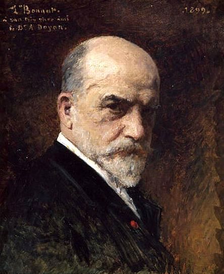
The portrait was painted by the then famous portraitist Leon Bonnat (1833 – 1922), a French artist who studied in Spain and combined the methods and aesthetics of both the French and Spanish traditions. The portrait is especially interesting because it was left in a semi-finished stage clearly showing Bonnat’s painting process. While the artist was working on the portrait the sitter died tragically and the painting was never finished. The portrait was commissioned by Marshall Field I who was known as the mercantile king of Chicago, starting the Marshall Field Company that was the most prominent department store in the Midwest for over a century and a half.
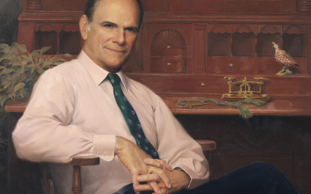
Recently Marshall Field V decided the portrait, even in it’s unfinished state, should be hung with all the other Marshall Fields through the generations. He added a portrait of himself (see my portrait of him below—also included in the article).
I am sincerely gratified that my painting is in Mr. Field’s collection because of his reputation as an extremely knowledgeable connoisseur of classic American painting.
Richness of Color in Oil Painting
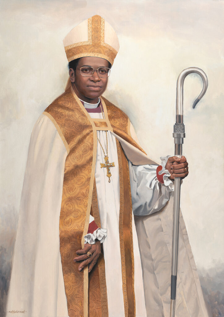
To see the article as it was originally published in the October/November issue of International Artist magazine click here.
During my forty years of teaching portrait painting I have often heard students ask, “How do I get rich color in my paintings?” They complain that their colors are muddy or chalky and that their flesh colors in particular seem dead and mannequin-like.
There is no simple answer to that question. Just to define richness of color is difficult, especially in scientific terms. Artistically, rich color is full and clear, not murky or indecisive in its position on the color wheel. It tends to be subtle but lively, deep but not necessarily vivid. Being able to recognize this quality and knowing when it is absent is the starting point in resolving the problem of how to make a richly colored painting.
With the ability to recognize color richness, attaining it in oil paint can be fairly straightforward—although with many different approaches to the subject, discovering which ones fit your style and technique can be challenging. Combinations of pigments, mediums or surfaces that are helpful for one artist may not be practical for another. So consider the following options or approaches and experiment with each one to find which are most applicable to your special way of painting.
Color Mixing and Proportions
The proportions in the mixing of colors are the foundation of creating richness. This ability is often a matter of innate judgment or a familiarity gained from studying the paintings of more experienced artists, but an extremely helpful principle in the process is simply this: avoid both gaudy and murky colors. Finding the right color notes between those extremes with smaller accents of vivid colors here and there can bring you, the artist, closer to success.
Although a painting can have vivid passages without being gaudy, the majority of colors should not be pure primary or secondary colors that are extreme in their saturation to the point of rawness. Because of that many of the colors in a composition may need to be subdued somewhat —without being deadened. That can be done by using one or two of the following methods:
• adding an earth color
• adding a complement —color on the opposite side of the color wheel
• adding a color that leans away from its adjacent color in the spectrum but not all the way to its complement on the opposite side of the color wheel.
• adding black.
• adding white.
But going too far in the process of subduing colors can also damage their quality: that often happens when more than a couple of these methods are used in the same mixture—leading to a loss of color definition—a murkiness. If you are using more than three of them you are very possibly headed for trouble. In that case the colors can be salvaged by adding to the mix another pigment color that is pure, distinct and vivid on the color wheel. This will give the color in question a definite clarity in hue no matter how subtle the artist determines the painted passage should be.
A dirty color, simply put, is a brown or grey that does not know what kind it wants to be. In approaching a problem color of that kind an artist can ask, “Is it a green brown, an orange brown, a purple brown?” Or, “Is it a purple gray, a green grey, a blue gray?” If a brown or gray cannot define itself in those terms it will typically be perceived as a muddy or dirty color—richness being the opposite of that. And if one of them cannot be defined in that manner the solution is to add a color that sets it on its course of being distinctive in its kind of brown or gray.
Broken Color and Half-Mixing
People working in traditional impressionist styles avoid these problems by laying colors next to each other, giving the optical effect of mixed colors without creating the collisions of different pigments that deaden each other when they are blended into the same paint mixture. Another method related to that, used by many of the old masters and present in the works of some of today’s painters, is the process of half-mixing. Half-mixing, as the term suggests, means only partially blending the colors (rather than thoroughly). Halfmixing allows you to streak together strings of independent colors that function somewhat in the same way as the impressionist’s method. Artists who work directly and rapidly—alla prima—usually keep exceptional life in their colors in this way.
Light and the Paint Film
Alla prima painters (as the Italian term “at once” implies) usually reject or avoid using second layers of paint. (Early Flemish painters were of the same mind although they were painting in a more piece-meal manner over an extended length of time.) Logic supports that approach. One layer of paint, whether thick or thin, contributes to a richness, or a “freshness” or even a sense of illumination. This is because light passes through the paint directly to the white or lighter colored ground, its reflection lightening the wet layer without the need for adding a significant amount of white paint—white pigment being an agent that diminishes the strength of colors in paint mixtures. Adding just one extra layer of paint on top of the original layer seals off the light to a greater degree, requiring the use of more white which then reduces the color saturation.
For many artists however, restricting work to one layer limits the option of making essential adjustments by over-painting. In over-painting light carries the color from one dried film into another (rather than combining them in the same wet mix). Renaissance artists used successive layers to their advantage in this way, creating rich and beautiful effects with a much more limited selection of pigments than we have available today. In fact, perhaps because of this constraint, they developed an acute awareness of the transparencies, and translucencies (partially transparent or semi-opaque qualities) of their paint films and made conscious use of the colors and values beneath each of their layers. Much thought was given to the preparation of preliminary layers to give maximum effect to those that followed. The lights were often painted lighter in the earlier layer and the darks darker in the earlier layer to create the desired later effect. There was often a cooler color beneath a warm second layer or a warm beneath a cooler layer. If the artists were not satisfied they repeated the entire process of layering again until the desired effect was achieved.
Another general principle: consider that second layers of paint should have different considerations than first layers. For example, second layers might require adding slightly more vivid colors to the mix. If you are painting in layers, remember that using the same mix of colors in the second layer that was used in the first one will never give the same results.
Balance
Success in a painting is generally dependent on balances between types of colors. Balance does not necessarily mean equal parts but rather a clear, conscious arrangement so that the different types are complementary or supportive of each other. Specifically, to achieve richness in color an artist needs to balance the following:
• cool with warm colors (cools being greens, blues, and purples; warms being reds, yellows, and oranges) • saturated (vivid) colors with more subdued colors
• transparent, or at least translucent, with opaque colors (translucency means semi opaque or semi transparent)
In portrait and figure painting in particular, success depends on the use of a wide range of translucencies in the paint because flesh as a whole, even from person to person, is a matter of degrees of translucency.
Transparency and Translucency
Color is nothing without light and to a large degree, controlling the effects of light gives us mastery over color. Even for those who choose the old master method of layering, the example of one layer of alla prima painting clearly demonstrates the roles that transparency and opacity play in the creation of quality coloring. Allowing light to pass through and distribute itself within the paint film, interacting with the pigment particles, and reflecting back to the viewer’s eyes is the essential role of transparent or translucent paint. Therefore, adjustments in the degree to which light passes through a paint film gives the artist control over that factor in the creation of rich coloring.
Each of the pigments has its degree of transparency or opacity and many of today’s paint manufacturers state on their labels the degree of either of those for each of their colors. Through experimentation an artist can find the appropriate combination of these two opposite qualities for a particular kind of artistic expression and level of richness. For example, a translucent zinc or flake white might require a more opaque color mixed with it than a titanium white would require. Or perhaps a mix of the opaque titanium and an opaque red oxide might be too opaque, when a mixture of titanium and the transparent burnt sienna could give just the right kind of translucency.
Painting Mediums
Another means of controlling the amount of light passing through a paint film is the paint medium. Artists who make their own paints have the maximum control over this factor, although few artists today are willing to go to that length in their craftsmanship. Instead artists add oils, spirits and resins (typically referred to as the artist’s medium) to the tubed commercial paint and this can have significant effects on the way light travels through the paint film. Adding more oil generally creates more transparency or translucency than less oil because it suspends the pigment particles in a thicker dried film allowing for more light activity within it. Using a thickened oil, like stand oil, which has been partially dried, creates an even deeper film that can affect our experience of color in a way similar to that of light coming to us from behind a thick piece of colored glass. We get from it a sense of what is described as “luminosity” in paint.
The addition of a natural resin (e.g. damar and copal) or synthetic resin (e.g. alkyd) to the medium can help to create that effect. Resins in general, whether used in the paint medium or on top of the paint film, help create a more level surface, an even gloss, which in turn helps in the way light enters the film and returns to our eyes.
A resin as a part of the medium also strengthens the film for the artist who prefers to paint in thin layers. The spirits or volatile solutions typically used in thinning paint evaporate after the paint has been spread out, adding nothing to the film, Consequently excessive reliance on spirits can leave the film weakened and vulnerable to cracking. Using resin with the mixture allows the paint to be used thinly yet maintain a substantial enough film to keep the pigment particles suspended for adequate play of light while minimizing the risk of cracking.
Final Varnish
Resin used as a final varnish, and used thickly enough, typically enhances a painting’s colors. Why is this so? Whether paint is laid down in a smooth or heavily textured way, the paint surface has microscopic bumps and hollows that fracture the light rays sending them off into different directions. Consequently less light goes deep into the film to carry color back to our eyes. A layer of varnish contributes to leveling out the surface of the painting so that the light rays enter and come back to us in a more uniform, less splintered way. Picture a rock on the beach which is moderately colored when it is dry but much deeper and richer in color when wet. The same principle is at work there. The water creates a more level covering over the rock’s surface, affecting the course of the light rays before they reach the uneven surface.
The Ground (Painting Surface)
The levelness of the ground (the prepared surface of the board or canvas) can contribute to the leveling of the painting’s surface, helping the light to travel more freely into the paint film and back again, relatively unobstructed, which in turn affects the quality of the color. Avoiding brush strokes when applying the primer and sanding between layers and after the final one can help in this respect.
The absorbency and porosity of the primed ground can also affect the final richness of color because an absorbent and/or porous ground can drink or pull the oil of the paint medium into the ground, substantially robbing the paint of its transparent film.
- For this reason an oil ground (less absorbent) is generally better than an acrylic gesso ground (more absorbent) for creating a richly colored oil painting. The traditional gessos, (marble dust and glue) were also too absorbent for oil painting unless an oil was added to the gesso.
- Porosity can be avoided by filling the crevices between the threads of a canvas surface thoroughly with glue and oil primer. Using a finely woven canvas can also be helpful.
- Working on a wood or hard board panel avoids much of the problem of porosity because it is a solid, flat surface without the depressions that exist between the threads of a canva
Composition
Armed with this knowledge of the technical aspects of creating rich color will have little effect without an accompanying sense of how colors relate to each other in a composition as a whole. Each color in a painting is perceived within the total arrangement— or simply put, everything is what it is in relation to everything else. A red dress in a white room for example is very different from a red dress in a black room or a purple room, or a purple grey room. The artistic judgment in this respect, again, comes down to an artist’s innate talent, experience at painting, and thoughtful study of works by artists who have been successful in this respect.
What constitutes a strong composition with regard to color? The color notes (independent passages of color and value, similar to notes in music) have to have adequate contrast but they must also complete each other in a way that gives us a sense of an interrelatedness or harmony— even when an element among them is intentionally dissonant. All of the colors in a painting should work together, as all the instrumental parts in a symphony work together, creating a resonant tapestry-like effect. In a successful painting no one color acts totally alone, even when there is a solo movement within it.
Summary
While simply replicating the color processes of more experienced artists can bring some success, knowing why some methods create rich colors and why some create dull, lifeless colors gives you, the artist, the resources to overcome obstacles to good coloring , better preparing you to create for yourself, and for others, an artistic expression that is rich, whole and life-affirming.
This article was published in International Artist magazine.
Richness in Color in Oil Painting: New Article by Richard Halstead
In the current issue of International Artist magazine, October – November of 2019, is a new article by Richard Halstead: “Richness of Color in Oil Painting.” Be sure to pick up a copy! Learn more here.
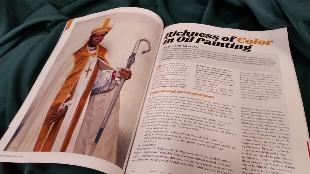
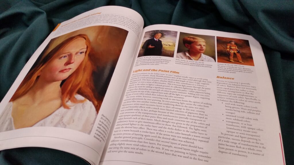
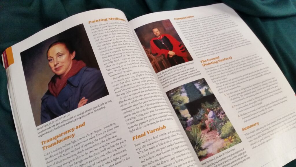
The article will be posted on Richard’s blog in the future, so keep an eye on this website for more info.
To learn more about richness in oil painting and other topics, attend the school: course information.
Portraits of Livestock Industry Legends
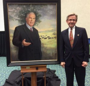 In addition to portraying cardinals, governors, prominent lawyers and doctors, and philanthropists, over the years Richard Halstead has created 23 paintings of the leaders of the American livestock industry. With Halstead paintings in the collections of the National Portrait Gallery, state capitols and universities, Richard’s paintings are also part of an unusual special collection. Legendary breeders of beef cattle in Scotland in the late 18th century, outstanding early and modern educators in animal husbandry, and current leaders in livestock production have been honored by their induction into the collection of portraits of the nationwide Saddle & Sirloin Club.
Believed to be the world’s largest portrait gallery commemorating a single industry, the portrait collection was established at Chicago’s Union Stock Yards in 1903 and is a somewhat unexpected example of the tradition of portrait painting providing a compelling visual component of the history of livestock development, especially in the Americas.
 Each year a leader who has made a major contribution to the industry is selected for this award. In 2017 Angus beef cattle leader Tom Burke was honored and Richard completed his portrait for its unveiling in conjunction with the North American International Livestock Exhibition in Louisville, KY, in November 2017.
The Kentucky Exposition Center houses the entire collection and some of the most recent portraits by Richard are on permanent display.
The Quiet Power of Ellen Eagle
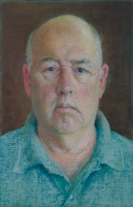
When I look at Ellen Eagle’s work I am reminded of my earliest interest in portraits. I was a boy, looking at reproductions of old masters’ paintings in my parents’ attic, moved by something immediately present about them but other world at the same time. Eagle’s works are like that. They are very specific to the individual sitter’s character and momentary presence, but larger yet— universal and timeless.
The famous teacher, Robert Henri once wrote: “There are moments in our lives, there are moments in a day, when we seem to see beyond the usual- become clairvoyant. We reach then into reality. Such are the moments of our greatest happiness. Such are the moments of our greatest wisdom. It is in the nature of all people to have these experiences; but in our time and under the conditions of our lives, it is only a rare few who are able to continue in the experience and find expression for it.” The Art Spirit
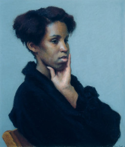
Andrea
14″ x 12-1/4″, Pastel
Eagle’s portraits are very different from Henri’s, but ironically they are the quintessence of that statement. They are so utterly real, so painfully everyday, and yet they are bathed in an ambient light that suggests her subjects are somehow blessed by an unseen presence.
I am drawn back to Eagle’s paintings whenever I grow tired of the affectations of so many contemporary portraitists. I am at first restored or refreshed by the honesty of her portrayals. Then as I study them more closely I find that little firings are going off in my brain that I can only describe as an experience of being repeatedly stunned by what she has accomplished within that quiet, unassuming presentation. Each small section is a new surprise with its own impact, yet each is perfectly integrated, so that a viewer can comfortably explore the face or figure without feeling lost or disconnected from the whole. Who would guess that there could be such subtly interwoven passages in the depiction of a single figure?
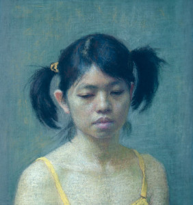
Mei-Chiao
6-1/2″ x 6-1/4″, Pastel
The people in her works, as well as her technique, are unashamedly earthy and plain but painted with the sensitivity and intricacy of a Chopin sonata. This intrinsic contrast is the basis of her power: contrast between that which is weighty and elemental, and that which is sensitive and refined; contrast between deeply felt emotion, even passion, and the restraint of discipline and thoughtfulness; contrast between the simplicity of a single figure and the complex arrangement of subtle movements within the figure and within the light and space that surrounds it. These contrasts fittingly engender both a sense of serenity and of being very much alive.
Maurice
8-1/8″ x 5-3/8″, Pastel
If you are put off by the homeliness of everyday life, you may not like her work. But if you are not, Eagle’s paintings will lead you to an even greater belief, than you may already have, in the survival of the human spirit. Her work gives us faith in that. Some of us, at various points in our lives, have questioned our ability to survive with our authentic vision intact. Eagle’s paintings suggest that she too has struggled, possibly stumbling and doubting herself now and then, but that she has tenaciously returned to that steady gaze at life as it is—-in all its quiet glory. Her works give the impression that they were made by an artist with heart, stubbornness, and conviction.
If any of you have seen her paintings and not had this feeling, I suggest that you visit them again sometime when you have a quieter mind. They require patience and receptivity. Eagle’s vision will not leap out at you. It is too dignified and worldly wise to demand your attention. It is not advertisement for the artist but rather an intimate conversation with a close friend. If you take the time to study her portraits you discover that you are in a privileged space, talking about the deepest experiences of your life, or hers or that of the subject of the portrait.
The Canadian author, Margaret Laurence was once quoted as saying that she wrote about what everyone knew but never thought to write about. In a similar way Ellen Eagle paints what we all see and typically disregard as insignificant. Tactfully and unobtrusively she slips around the shields that her sitters wear to protect them from the world and paints them in the safety of her world. By allowing us to see them in this way, in their least guarded moments, she confirms for us that what is genuine is ultimately the most beautiful.
Portrait Painting in Chicago
To this day, many on the Eastern Seaboard consider the commissioning of painted portraits to be simply a matter of tradition and culture. Inherited from Europe and Britain during colonial times, portraits were, for over a century, their most common means of indicating a person’s status and place in history. And now, even with the technology that is available for creating immediate imagery, the painted portrait on the East Coast continues to be a symbol of distinction.
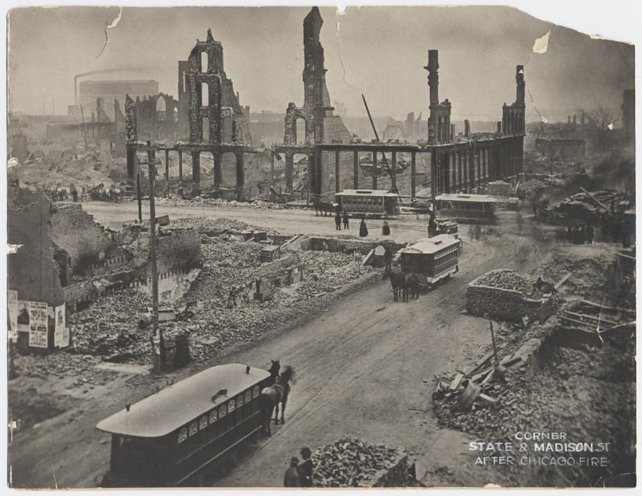
Chicago, on the other hand, was founded as recently as 1833, less than thirty years before the Civil War (1861–1865). Although the Civil War stimulated the city’s growth and economy, it stunted its cultural development. Then, only seven years after the end of the war, Chicago was devastated by fire and had to completely rebuild itself, delaying its cultural development even further. By that time, photography had become an art form in its own right and a reasonably efficient way of documenting a person’s physical character. Efficiency was a key word for the fast-growing new city. Portrait painting, to the Midwesterner’s pragmatic, bottom-line view of life and business, was an inefficient, nonessential item—even for luxurious living. Consequently, today the second largest city in the United States and a national hub of business can only lay claim to a scattering of early portraits and, in general, those are of a mediocre quality. Furthermore, Chicago’s social and financial elite have not typically thought of portraits as being a connection to their ancestors or to their progeny and future generations.
There have been some exceptions, however. One of the earliest portrait artists of real quality to live and work in Chicago was George Peter Healy. Originally from Boston, Healy was classically trained in Paris by two of the most celebrated artists of that time, Thomas Couture and Antoine-Jean Gros. He became so admired as an artist in France that he was commissioned to paint King Louis Philippe. Following that the King then commissioned him to paint portraits of the most important leaders in the United States, which brought him back to his native country. That led to a long succession of solid, insightful portraits of many of America’s presidents, statesmen, business leaders, and contributors to the country’s arts and letters.
Healy came to Chicago in 1855 and painted portraits of Illinois’ most influential figures until he left in 1869. He was in Springfield to paint Abraham Lincoln shortly after Lincoln had won the the Republican Party’s presidential nomination. Healy found Lincoln to be an especially entertaining, convivial sitter, laughing at his own stories and making the time pass rapidly. At one point during the sittings Lincoln was going through some letters and he began to laugh. He read to Healy the letter, which was from a young girl who wrote that he would look better and would have a better chance at winning the presidency if he were to grow a beard. Lincoln asked Healy if he would like to paint him with a beard, to which Healy responded, “No.” The resulting portrait in fact presents the future president in a way that is very different from the iconic, bearded image that we now associate with him. It is more youthful, more open, and, I think, more revealing of the essential person than we see in any of the other portraits of him before or after that.

Presidential hopeful, Abraham Lincoln, by George Peter Alexander Healy
After the Civil War, while Healy was again in Europe, Congress commissioned him to paint a posthumous portrait of Lincoln. The figure was based on a painting Healy had previously made of Lincoln conferring with Generals Sherman and Grant and Admiral Porter. In the portrait Lincoln is represented in a thoughtful, attentive pose, leaning forward with his bearded chin resting against his hand. With this painting, Healy finally had an opportunity to paint the president as Lincoln’s young admirer had suggested.
In 1892, after more than two decades of painting continuously in Europe, Healy returned to Chicago—quite possibly to contribute to the Columbian World Exposition—and died in Chicago a few years later.
One of the greatest “direct,” bravura style painters of all time, Anders Zorn, came to Chicago to participate in the Exposition in 1893 and immediately took a liking to the city and its people. Despite his immense talent, international acclaim, and his marriage to a wealthy society woman, Zorn had received a rather haughty reception from the upper classes in Europe. According to Zorn, they behaved with “ceremonious style and artificial customs” that he never felt comfortable with (from “Saint-Gaudens, Zorn and the Goddesslike Miss Anderson” by William E. Hagans). Chicagoans, on the other hand, responded more to the quality of his work and character than to his pedigree, which was of a Swedish peasant stock. The simple, warm welcome Zorn received from Chicagoans was heartening to him and was confirmation of what he had come to feel in general about Americans. According to biographer William E. Hagans, Zorn wrote the following in his memoir: “Over there [in America], when they say ‘He’s all-right,’ all doors open to the foreigner, which Europeans cannot understand. Openness, honesty, straightforwardness, punctuality, these things are included in the testimonial ‘He’s all-right.’”
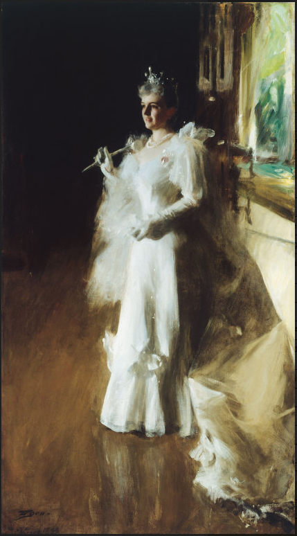
Naturally then, Zorn stayed in Chicago for a while. During his stay, he painted some outstanding portraits of Chicago’s industrial, commercial, and political leaders, such as Charles Deering (in the collection of the University Club), son of the founder and CEO of International Harvester, and department store magnate Potter Palmer and his wife. He also painted the chief architect of the Exposition, Daniel Burnham, and two U.S. senators from Illinois.
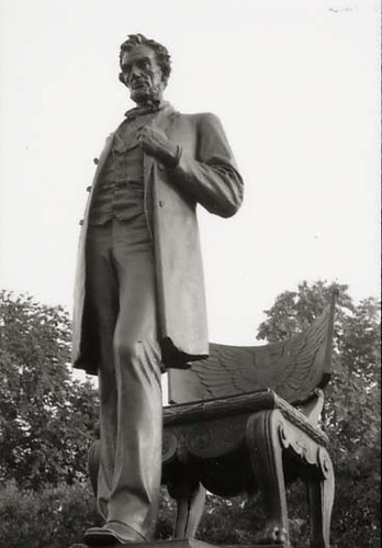
President Abraham Lincoln by Augustus Saint-Gaudens
The sculptor Augustus Saint-Gaudens, who was a friend of Zorn’s and also came to Chicago because of the Exposition, left some truly great portrait sculptures here as well. His full-figure sculptural portrait of Lincoln in Lincoln Park is one of his most impressive pieces and certainly one of the finest and the strongest, symbolic portrayals of President Lincoln and the principals he now represents.
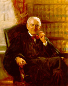
Justice John Paul Stevens, U.S. Supreme Court, by Jim Ingwerson
Since the 1960s, James Ingwerson has been the most prominent of all the Chicago portrait painters. There have been other portraitists of quality, but during his long career, Ingwerson has consistently stood at the summit.
Ingwerson’s quiet, unassuming manner belies the solidity and confidence that can be seen in his paintings. Looking at one of Ingwerson’s portraits, one is immediately struck by the perfect balance between the painting’s quality and the quality of the person portrayed. They are painted with a skill and a grace of execution that seems effortless, yet above all else there is great dignity in his creative expression, reflecting the character of the artist as well as that of his subjects.
In addition to subjects across the country, Ingwerson has painted many of the most influential Chicagoans of the past half century, and I am convinced that his portrayals of them will survive far beyond anyone’s memories of the people, just as Healy’s and Zorn’s will.
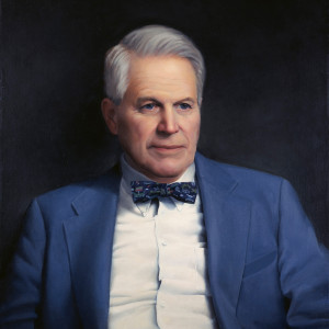
John Baird, CEO and Chairman, Baird & Warner, by Richard Halstead
Realism in general has had a difficult time reestablishing its acceptance in Chicago, however. After the 1940s, Chicago’s elite,feeling somewhat provincial in comparison with their eastern cousins, embraced the latest and often iconoclastic fashions in art. Not until recent years have tastes here become more eclectic and, as a result, have traditional art and portrait painting been given a fresh evaluation. Now, at long last, painted portraits are not competing with photography as they did in the past but, instead, generally live side-by-side as separate entities. There also seems to be an easier relationship between the traditional and contemporary arts, the two sometimes mixing in the same environment.
I believe we, here in Chicago, are about to enter an interesting period for portrait art. I sense that it is reemerging as a new tradition—not as an imitation of a past tradition or as an appropriation of other cultures’ customs, nor even as a self-conscious reaction to either of those. I believe a new tradition for portrait painting is emerging as something fresh, original, and distinctly ours, a tradition that specifically represents the values and life today in Chicago and the Midwest.
Fine Art Connoisseur Magazine Presents Richard Halstead on John Singer Sargent
July/August 2014 Fine Arts Connoisseur
If you enjoyed Richard Halstead’s blog post about John Singer Sargent, you will want to pick up a copy of the 2014 July/August issue of Fine Art Connoisseur magazine, which reprises his post as an article titled “The Musicality of John Singer Sargent.” And, once you own the issue, I predict you’ll want to display it in the room where you do most of your relaxing and entertaining. That way you can easily pick it up to reread Richard’s insights and review the gorgeous Sargent paintings reprinted to illustrate his points. You’ll also have it easily on hand to share with fellow artists and art lovers.
—Laura Allen-Simpson
A Fresh Way to Appreciate the Phenomenon of John Singer Sargent’s Paintings

The Wyndham Sisters by John Singer Sargent
Considering how many books and articles have been devoted to John Singer Sargent’s life and paintings, there is surprisingly little written that attempts to explain the phenomenon of his paintings. Even artists who emulate his style generally see them as the works of a transcendent mind that can never be understood through analyses. For many of the students and followers of Sargent, the spontaneity within his paintings is the essence of that transcendent mind. Consequently, the principle they tend to apply when viewing his work, or in making their own paintings, is “Don’t think too much.”
He did fill his paintings with spontaneous passages, as a jazz musician might, and after a brief time early in his career it seems that he went directly into his paintings without any significant compositional studies. Nevertheless, there is a conscious mind behind those flashes of genius, judging, selecting and organizing them into a cohesive whole. Sargent was said to have frequently scraped down, rubbed out and reworked various areas to get the effects that he wanted. The combination of letting things fall as they may and of reconsidering or editing from those moments is what made his paintings great works of art.
Sargent had a special advantage over other artists in that he could think at an extraordinary speed. That may seem like an insignificant detail, but in a direct painting style an artist has to make important decisions within the limited time he has before the paint dries, just as a musician’s mind has to work at the speed or tempo of the piece he is performing. Sargent had a quick and agile mind, and one that could think throughout that drying time toward a final and complete orchestration.
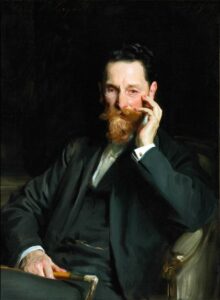
To have a basic understanding of Sargent’s creative process, a person needs to consider what Sargent was not. He was not an artist consumed with interest in the subject’s character, so he was not distracted by it. While he was painting a portrait of the publisher Joseph Pulitzer, he actually stated that he was not interested in character, saying, “Sometimes I get a good likeness—so much the better for both of us. Sometimes I don’t—so much the worse for the subject, but I make no attempt to represent anything but what the outward appearance of a man or woman indicates.”
He was more interested in the ballet of the figures moving about in the illusionary worlds he created on canvases and in the visual music of his compositions and brushwork. Essentially, he was consumed by the creation of beauty, and he seems to have had no need to “say” anything beyond that. His clients must have sensed this fact even if they didn’t understand it. In their day, his portraits were recognized as elegantly modern images in which people wanted their likenesses placed, even if that likeness was vague.
I believe the best way to understand Sargent’s work is to see in his paintings parallels to music. Music is a timeline form of art (art that moves in time) in which the lyrics, if they are used, are carried by the rhythm, melody and spacing of time within it. Painting is a static form of art, but we view it in a timeline manner, according to where and in what priority our attention lands in different parts of the composition and pictorial space. In a good painting, our attention is guided by principles very much like the rhythm, melody and spacing in music. All representational or realistic paintings, if they are successful, are carried by these elements, described generally as design or composition, or as an underlying abstraction.
The realism in these paintings can be equated to the lyrics in a song in that both refer to ideas (often described as programmatic in music). In representational art, as in music with lyrics, there is always a balance between a reference to ideas, or meaning, and the composition or design that carries that meaning. Generally, however, one side of the equation is more dominant than the other.
In Sargent’s paintings, the realism is of an extremely high order, but the design (the shapes, texture, color, brushwork, form, and movement) predominates in the way it carries that realism. Music lovers talk about being swept away by a particular piece of music and that is very much like what happens to those of us who love Sargent’s work. The abstract side of his paintings moves us with the conspicuous excitement and grace of his execution and the unique patterns of his compositions.
But even with that predominance of abstract design, the realism is strengthened by it because it contributes largely to the feeling of life and liveliness of the figures. Sargent’s paintings are grounded in traditional realism, as dancers in a performance are grounded by the stage beneath them, reminding us that they are real people. Sargent’s paintings are firmly planted in the here and now, but the beauty of his performance, as with ballet or opera, is what moves us and elevates us out of the stresses of our daily routines.
So I was not surprised when I learned that Sargent was an accomplished musician as well as a painter. Percy Grainger and Gabriel Fauré, famous musicians and close friends of Sargent’s, said of him that his musical ability was as great as his painting skills. It is apparent, therefore, that either music had a profound influence on the way he painted and the way he thought about painting, or, music and painting were just two aspects of the same thing for him. I’m inclined to believe the latter.
My friend, the French-horn player Lisa Taylor, wrote to me recently describing Sargent’s paintings as having, “a richness, joy, lyricism and mastery of rapturous melodic line and harmony.” She compared them to compositions by the musical impressionists Fauré, Ravel, and Debussy and to the works of Shubert, Dvorak, Mozart, and Brahms, whose compositions she described as “sound tapestries of different textures and colors, created by composers who brought out the best of each instrument for which they composed.”
Others have compared his work to jazz greats. Gerald Lazare, an artist friend and honorary member of the Duke Ellington Society of Canada, sees parallels between Sargent’s paintings and Ellington’s compositions, which combine the improvisations of jazz with formal composition. He compares the dramatic range of extreme lights to extreme darks in Sargent’s paintings with Ellington’s way of using a range of sounds from the highest clarinet to the lowest baritone sax.

Paul Helleu Sketching with His Wife by John Singer Sargent
People often compare Sargent to the artists Velasquez and Franz Hals because of the looseness and dash of their brushstrokes. The brushwork of these great artists, each in its way, is powerful and timeless in its expression, but neither artist’s work has the flowing musical quality that exists in Sargent’s paintings. I associate him more with painters of the late Renaissance and Baroque periods in Italy, especially those in Venice, which was once known as the Republic of Music. The paintings of Veronese, for example, are composed as if they are rolling with elegant song and celebration; Guardi’s brushstrokes are like clear, decisive rings from brass and reed; Tiepolo’s paintings are grand opera at its best; and Tintoretto’s have the energy and intensity of some of the symphonic music of the Romantic period.
To see the musicality in Sargent’s paintings is to expand our experience of them and to understand ourselves better in the course of doing that. The first reaction most of us have to his work is awe. We feel a vicarious thrill in the power and assuredness of his athletic prowess as an artist. Then the music reaches us, independent of the performer and composer, and a door to pure exaltation opens to us. We become aware of that combination of classical order and pure, innocent joy. Many years ago, I saw on the back of an LP album cover a description of the Venetian composer Vivaldi that read, “Entirely serious in his joyfulness.” Could there possibly be a better tribute to the art and creative life of John Singer Sargent?

