
The Value of Painted Portraits

There are lots of organizations out there that have portraits painted, but this [Saddle and Sirloin Club] is one of the few in the country that has portraits painted as a part of their regular tradition for honoring the best and finest of their people.
Not everyone understands this, or the importance of portraits, or, in fact, the importance of tradition. Really we could just put our most honored people on a list that documents their contributions and we could put that up online with a visual documentation from a camera. That would certainly be efficient and economical.
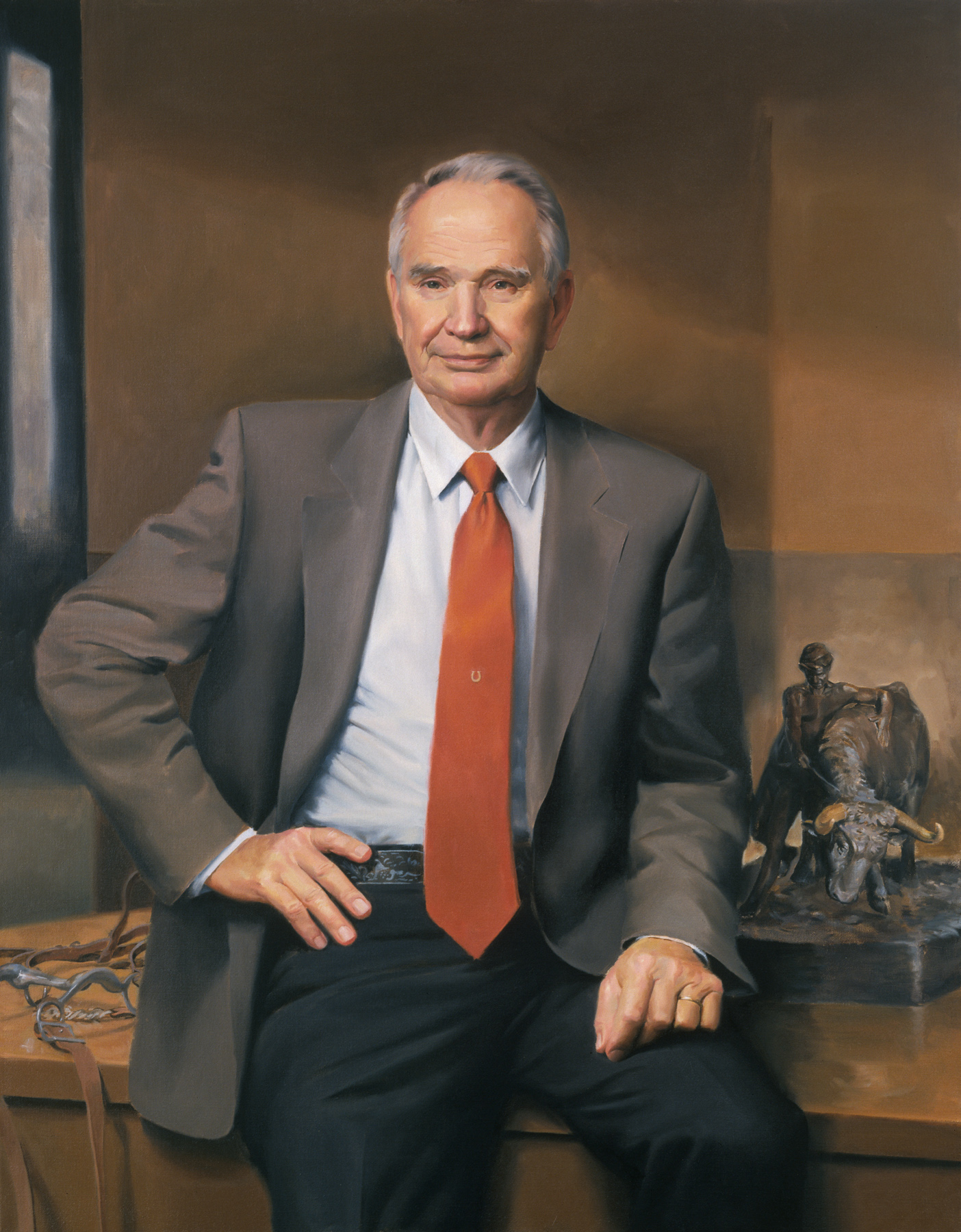
Portrait of Dr. Bob Totosek, Head of Animal Science Dept., School of Agriculture, Oklahoma State University
But a portrait, hand painted with brushes and colors mixed in the oil of flax seed, as portraits were centuries ago, and the thoughtful ritual of one’s peers unveiling that portrait, speaks of the unbroken connection that exists between people of outstanding ability and character from the past, with those of a similar kind in the present and those yet to come in the future.
That gives us a sense of timelessness I think, a kind of reassurance that something, our standards maybe, is not altered by the passing of time.
—Richard Halstead, from November 11, 2012 Speech at the Saddle and Sirloin Club
News About Richard Halstead’s Portrait of Indiana Governor Mitch Daniels

Governor Mitch Daniels (left) and Richard Halstead (right) flank Mr. Halstead's official portrait of the governor at the October 16, 2012 unveiling.
At a Statehouse ceremony on October 16, 2012, Richard Halstead’s portrait of Governor Mitch Daniels was officially unveiled. For details about the unveiling, the governor, and the portrait artist, click on the links below. (Yes, there are quite a few, but they are all worth checking out because each article offers something unique about the occasion—whether that’s information about inside jokes, additional images, quotes from Mr. Halstead’s speech, or further insights into the portrait painting process in the artist’s own words.)
“Daniels’ Portrait Unveiled At Statehouse” can be read at http://indianapublicmedia.org/news/daniels-portrait-unveiled-statehouse-38131/
“Meet the Man Behind Governor Daniels’ Portrait” can be read—and heard—at
http://www.wibc.com/news/Story.aspx?ID=1791511

© Daniel Axler. Courtesy of Daniel Axler.
“Portrait means Gov. Daniels now belongs to the ages” can be found at
http://www.nwitimes.com/news/state-and-regional/indiana/portrait-means-gov-daniels-now-belongs-to-the-ages/article_45e8acf0-7201-5831-9c69-e92b39800b9b.html
“Gov Daniels Portrait Unveiled” is at
http://www.z1071.com/news/region-news/42473-gov-daniels-portrait-unveiled.html
“Daniels’ Portrait Shows Indiana Governor at Work” can be found at
http://www.wsbt.com/news/wsbt-daniels-portrait-shows-indiana-governor-at-work-20121016,0,6177478.story
By comparison with the Eakins portrait of Dr. Gross, the realism that Beal proudly extols holds little interest
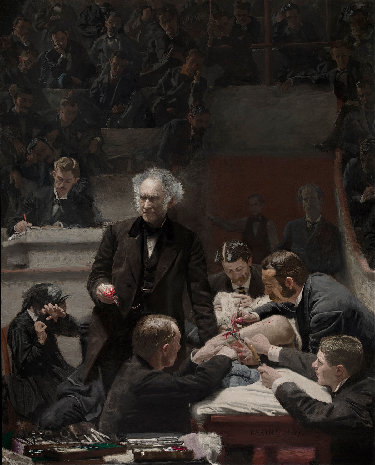
Portrait of Dr. Samuel D. Gross, Thomas Eakins
In the April 1999 issue of American Artist magazine the contemporary realist painter Jack Beal is quoted as saying about his commissioned portraits, “I tell my clients that when my portrait of them is finished, they will hate it—and their spouse will hate it even more. I capture more truth in a painting than anyone wants me to reveal, and that’s not necessarily flattering.” He also implies that his portraits’ power to disturb his clients qualifies them as museum-worthy, saying, “I warn my clients they will likely put the finished painting out of view for a while and eventually give it to a museum.”
Walt Whitman made a comparable statement about the nineteenth century artist Thomas Eakins when he said, “I never knew but one artist, and that’s Tom Eakins, who could resist the temptation to see what they thought ought to [be] rather than what is.” Eakins was like Beal in that he insisted on faithfulness to the truths before him, but beyond that the two artists are very different.
Although Eakins was ambitious to immortalize himself through his work, and was probably more concerned about his personal aesthetics than he was about people, his portraits never put his subjects beneath him. In fact his paintings often mirror and sometimes parallel the qualities of the people he painted. His portrait of the famous pioneering surgeon Dr. Samuel Gross is a remarkable example of that because it is an obvious, and I think successful, effort to put himself on equal footing with Gross—without diminishing Gross’s stature in any way.
Good composition in a portrait generally indicates an artist’s respect for his subject, or at least of what that person represents, because the solidity and grace it imparts suggests that comparable traits exist within the subject’s character. In light of that fact, the contrast between these two artists becomes even more apparent.
In the article mentioned above, “Jack Beal’s Portraits of Life,” the author Stephen Doherty emphasizes Beal’s interest in composition: “Beal frequently lectures and writes about composition, constantly urging artists to create the illusion of greater and livelier space within their pictures.” Beal’s early paintings sometimes had a rhythmic flow within the figures themselves but his later commissioned works, even within the figures, have none of that movement. Rather than creating the “lively space” he describes in his lectures, his pictures are often static, the shapes are sometimes repetitive and the compositions in general lack a prioritizing of the order in which the viewer’s attention is held. That is tantamount to not composing at all. Compare his composition in the portrait of President Olin C. Robison that hangs in the Middlebury College in Vermont with Eakins’s painting of Dr. Samuel D. Gross, painted for the Gross Clinic and now hanging in the Philadelphia Museum of Art.
[NOTE: To see Beal’s portrait, go to www.jackbeal.net/89_robison.html ; copyright prohibits us from making the image available here]
Eakins’s painting of Dr. Gross is built like a grand temple, a tribute to science and to the virtues of thought and accomplishment. It is architecturally solid and within that structure is a carefully choreographed scene. The combination of shapes and the lighting and shadows provide the same order of succession that dialogue and movement create in a masterful stage production. Eakins does not restrict our movements. Instead he gives us logical and inviting options. He allows us to travel throughout his illusionary space along any of many pathways, each one prescribed to give us the fullness of his experience of the scene. He imagines that each of us would enter the pictorial space from a different place with different initial interests and gives us the added option of changing course as our pathway crosses others, but he brings us all to the same ultimate conclusion or completion once we have absorbed the entire picture. None of the routes we might choose are boring. There is no redundancy in shapes or in emotional content. Each figure, including the patient and the students in the gallery, is playing a unique role with a different, very expressive gesture that is an integral part of the whole.
The scene Eakins created, and still creates, has stillness yet moves and has power. We feel a momentary hesitation between events, as if Dr. Gross has deliberately paused in his address to punctuate his last statement or to gain the audience’s full attention before his next point. Even the mood is a careful balance of various elements in the room.
Every small section in this pictorial space is accounted for. There is nothing extraneous. Nothing is overstated or understated. Eakins’s creation is a compositional masterpiece. It is an ideal that even he could not always live up to but which points the way for any person who aspires to create works that have lasting quality. It also should be instructive to those who, like Beal, have elitist notions about their compositional acumen when, in fact, they have taken a rather lackluster approach from start to finish.
By comparison with Eakins portrait of Dr. Gross, the realism that Beal proudly extols holds little interest for most of us, and his unwillingness to go beyond that, to add to that reality in any enriching way, makes his efforts seem empty, banal and pointless.
Factors to Consider When Creating Flesh Tones
 All students who strive to create life-like portraits at some point ask me, “How do I create flesh tones?” So, when I recently had occasion to put my answer to this question in writing—having been asked it by a former student via e-mail—I thought it might make a useful blog posting. With her permission, I have posted this student’s e-mail to me (for context) and the relevant portion of my reply. As always, if you would like me to explain any of this more fully, my studio door is open to you—as is this blog.
It’s Susan Dillard. A blast from the past. Still living happily ever after in South Carolina. . . . I am writing because I’m really struggling with my flesh tone palette and I was hoping you might give me a little direction.
When I came here [to South Carolina] and beg[a]n studying with Jean Pilk, who had studied for years with Daniel Greene, [she] directed me to use a palette of Cadmium Red light with Yellow Ochre as a base. From that she would mix variations incorporating different levels of grey. I have always found this combination to be unnaturally red.
Next, I studied Sanden’s palette, which again used red light and yellow ochre but calmed it down with viridian, or chromium green, or cerulean blue. His palette variations for halftones etc are very complicated.
I did a workshop in North Carolina last year with Rich Nelson. He simply uses Burnt Sienna for flesh tones. Adding other colors too it. Whoa!
Recently I ran across a blog Marvin Mattelson whose style and color are similar t[o] the flesh tones I have seen you use in the studio (although I have never seen your palette). He has taken ALL cadmium out of his palette. His goal is to create “natural not electric skin tones.” Here is his theory,
“I was drawn to the flesh tones of William McGregor Paxton, who in my humble opinion was the greatest colorist of flesh. Paxton theorized if we come from dust and return to dust we should use dust (earth colors) when painting flesh.” He says, “it is almost impossible to paint a bad looking flesh tone if you approach it intelligently. My flesh colors are, Venetian Red, Indian Red, Yellow Ochre, Raw Umber, Ivory Black, and Flake White.”
He also uses in his palette Ultramarine Blue, Permanent Alizarin, Viridian Green also Michael Harding’s Naples Yellow and Michael Harding’s Vermillion. Plus, neutral greys.
This sounds like a great palette because I’m looking for more natural tones in my work. But I almost become frozen when I lay out a palette. Do I premix? What color are shadows? What am I doing? It’s very confusing.
Any suggestions? I have loved the colors in your portraits more than any I have seen and I would love to get your thought on flesh tone palettes or any book suggestions.
—Susan Dillard, October 9, 2011
Dear Blast from the Past,
. . . . I like what you said about Marvin Mattelson and his use of color. His palette probably is not very different from mine. Pilk has a fairly decent idea with the gray but she would have very little variation because she has only one red and that one is not versatile. Nelson’s approach sounds limiting. Sanden is very efficient, obviously with all the commission work he does, but too systematic for me with all that premixing. I do think a really fine painting with fine flesh colors can be done with Mattelson’s palette.
A few thoughts:
1. The white factor. The richness, vibrancy or saturation of a color is always diminished and made cooler by the addition of white, especially a cool white like titanium. That’s why you always have to make a completely different mix from the light area to the middle tone area to the darks. Burnt umber in the darks could be too hot but stone cold gray in the lights.
2. The transparency or opacity of a pigment has a lot to do with its quality of color and that can differ quite a lot from one pigment to the other. You have to experiment to find exactly the right kind of transparency or opacity for representing a particular color in nature, and to do that you have to put together pigments with the right combination of those things in the right proportions, i.e., if you use the translucent white flake for flesh it might be better to use a more opaque yellow like Naples and if you use a more opaque white like titanium it might be better to use a semi-translucent yellow like yellow ochre.
3. Every basic color should have a pigment on either side of it. Red should have an orange side like cad. red light, and one on the purple side like alizarin. In the earth colors the same thing: Venetian red or burnt sienna on the orange side and Indian red on the purple side. Flesh colors are difficult because they are so subtle. So the trick really is in knowing how to get yourself in the ball park, or to a general color that is close, and then to tip it this way and that, on either side of the hypothetical middle color, red or yellow or green or blue, and so on until it falls into place just where you want it. There is no way around that. No simple silver bullet.
4. Variations of the colors, sometimes beyond the perfectly real and natural, make flesh seem alive and lively. That could be just the very subtle differences in a reddish beige color that shifts slightly from a more orange type to a more purplish type. In the cool areas the same idea applies: a beige or brownish that shifts a little toward green here and blue or purplish there might do the trick. The face has natural areas that differ in color that way but you can make the lights, darks, and middles tip in different directions to accomplish that too. Between those areas you can shift the colors subtly from warms to cools to warms to cools.
—Richard Halstead, October 10, 2011
More on the Wyeths and Wanting to Create What Does Not Come Naturally
There were three artists in the Wyeth family. The first was N.C. (Newell Convers) Wyeth, the second, Andrew Wyeth, and the third, James Wyeth who is the only one still living.

N.C. Wyeth illustration from Treasure Island
N.C. was very famous in his time and is still well known for his powerful, dramatic, operatic illustrations of adventure books and stories. His figures are heroic in proportions and always give the appearance of at least having a potential for violence. Solidly but simply constructed, they are made with little detail, yet the thick use of paint simulates the busy textures of nature, contributing to the dynamic quality of his work.
Andrew Wyeth was one of the best known artists in the country and is still well known for his quiet, austere, haunting images of people and scenes normally overlooked in the general scheme of life. (See http://www.andrewwyeth.com/index.html) His paintings are contemplative and they often have a sense of timelessness which is alternately unsettling and comforting. This effect was accomplished by a delicate balance between highly rendered details and compositional simplicity and by using form as means of creating subtle lighting effects that in turn created their special moods.
N.C. died with his grandson in a car-train accident. There has been speculation that the death was suicide possibly because of a bi-polar condition and ongoing angst over his unfulfilled attempts at bringing his work to a higher level.
Andrew Wyeth seemed to pity his father’s loss of faith in his own natural talents and for his attempts at creating work that was opposite that nature. But Ironically Andrew made the same mistake in reverse. N.C. dismissed the unique power in his dramatic illustrations and tried to create work that expressed the infinite and universal in the small and mundane aspects of life. In a similar manner Andrew gave less credence to the quiet timelessness in his paintings and more to a powerful force that he preferred to believe was emanating from them.
I think both men were more honest with themselves when they were young than when they were in their later years—truer to themselves before they began to judge themselves against all they admired in life, and in each other.
When N.C. was a young illustrator and doing research for illustrations on the western plains of the U.S. he wrote home about how life there “clutches me like some unseen animal.” Later in his life he wrote “The significance of a tiny speck of bark on the pine tree assumes the proportions of the infinite sky”—words that better describe his son’s work than his own.
Andrew said, by way of describing Rembrandt’s paintings, “His people turn toward the light. but it’s frozen motion; time is holding its breath for an instant—for an eternity. That’s what I’m after.” But later, when the quality of his work had declined he spoke as if his paintings were charged with heightened emotions, using words like anger and intensity, which better describe his father’s work.
The loss of self is not unusual among artists. A consciousness of self expression is a relatively new requirement in the history of art and is, I think, one of the primary difficulties for artists today. Until the19th century it was a secondary concern. Finding one’s self and creating an effective means of expression that meets the present sense of art’s function is often a mirage-like experience. The more deliberate we are about it the more it seems to slip away form us. That is the most difficult lesson to learn in creating art and the most difficult puzzle to solve.
Thoughts on a Passage from Andrew Wyeth
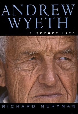
Andrew Wyeth, A Secret Life (Book Cover)
I thought you would like this passage from Andrew Wyeth: A Secret Life.The author describes Andrew’s understanding of his father’s struggles:
“From his boyhood he had watched his father churning with philosophic introspection and rejecting the innate gifts that gave his art its power—his mastery of drama, his fierce sense of romance, his counterpoint of violence and sentiment. ‘He tried to get serious and do other things,’ Wyeth says sadly. ‘But they didn’t have his quality. That’s the tragedy of my father’s life.'”
I think there’s a great lesson there. Most of us are inclined to dictate for ourselves who our instinctual selves should be but that’s a fundamental contradiction and the results, artistically, are never satisfactory.
Even if what we see in our natural talents isn’t on the level of our hero’s there is still at least the flicker of artistic genius there. If we want to accomplish something of real worth, we have no choice but to identify it, recognize it, embrace it as our own and put it to use.
That’s the nut of what I’m always trying to do in teaching: Guiding students to that recognition.
Mailing Address: 3320 Culver St., Evanston, IL 60201
Studio/Classes: 1316 Sherman Avenue #216, Evanston, IL 60201
847.869.6560
![]()