Richness of Color in Oil Painting
To see the article as it was originally published in the October/November issue of International Artist magazine click here.
During my forty years of teaching portrait painting I have often heard students ask, “How do I get rich color in my paintings?” They complain that their colors are muddy or chalky and that their flesh colors in particular seem dead and mannequin-like.
There is no simple answer to that question. Just to define richness of color is difficult, especially in scientific terms. Artistically, rich color is full and clear, not murky or indecisive in its position on the color wheel. It tends to be subtle but lively, deep but not necessarily vivid. Being able to recognize this quality and knowing when it is absent is the starting point in resolving the problem of how to make a richly colored painting.
With the ability to recognize color richness, attaining it in oil paint can be fairly straightforward—although with many different approaches to the subject, discovering which ones fit your style and technique can be challenging. Combinations of pigments, mediums or surfaces that are helpful for one artist may not be practical for another. So consider the following options or approaches and experiment with each one to find which are most applicable to your special way of painting.
Color Mixing and Proportions
The proportions in the mixing of colors are the foundation of creating richness. This ability is often a matter of innate judgment or a familiarity gained from studying the paintings of more experienced artists, but an extremely helpful principle in the process is simply this: avoid both gaudy and murky colors. Finding the right color notes between those extremes with smaller accents of vivid colors here and there can bring you, the artist, closer to success.
Although a painting can have vivid passages without being gaudy, the majority of colors should not be pure primary or secondary colors that are extreme in their saturation to the point of rawness. Because of that many of the colors in a composition may need to be subdued somewhat —without being deadened. That can be done by using one or two of the following methods:
• adding an earth color
• adding a complement —color on the opposite side of the color wheel
• adding a color that leans away from its adjacent color in the spectrum but not all the way to its complement on the opposite side of the color wheel.
• adding black.
• adding white.
But going too far in the process of subduing colors can also damage their quality: that often happens when more than a couple of these methods are used in the same mixture—leading to a loss of color definition—a murkiness. If you are using more than three of them you are very possibly headed for trouble. In that case the colors can be salvaged by adding to the mix another pigment color that is pure, distinct and vivid on the color wheel. This will give the color in question a definite clarity in hue no matter how subtle the artist determines the painted passage should be.
A dirty color, simply put, is a brown or grey that does not know what kind it wants to be. In approaching a problem color of that kind an artist can ask, “Is it a green brown, an orange brown, a purple brown?” Or, “Is it a purple gray, a green grey, a blue gray?” If a brown or gray cannot define itself in those terms it will typically be perceived as a muddy or dirty color—richness being the opposite of that. And if one of them cannot be defined in that manner the solution is to add a color that sets it on its course of being distinctive in its kind of brown or gray.
Broken Color and Half-Mixing
People working in traditional impressionist styles avoid these problems by laying colors next to each other, giving the optical effect of mixed colors without creating the collisions of different pigments that deaden each other when they are blended into the same paint mixture. Another method related to that, used by many of the old masters and present in the works of some of today’s painters, is the process of half-mixing. Half-mixing, as the term suggests, means only partially blending the colors (rather than thoroughly). Halfmixing allows you to streak together strings of independent colors that function somewhat in the same way as the impressionist’s method. Artists who work directly and rapidly—alla prima—usually keep exceptional life in their colors in this way.
Light and the Paint Film
Alla prima painters (as the Italian term “at once” implies) usually reject or avoid using second layers of paint. (Early Flemish painters were of the same mind although they were painting in a more piece-meal manner over an extended length of time.) Logic supports that approach. One layer of paint, whether thick or thin, contributes to a richness, or a “freshness” or even a sense of illumination. This is because light passes through the paint directly to the white or lighter colored ground, its reflection lightening the wet layer without the need for adding a significant amount of white paint—white pigment being an agent that diminishes the strength of colors in paint mixtures. Adding just one extra layer of paint on top of the original layer seals off the light to a greater degree, requiring the use of more white which then reduces the color saturation.
For many artists however, restricting work to one layer limits the option of making essential adjustments by over-painting. In over-painting light carries the color from one dried film into another (rather than combining them in the same wet mix). Renaissance artists used successive layers to their advantage in this way, creating rich and beautiful effects with a much more limited selection of pigments than we have available today. In fact, perhaps because of this constraint, they developed an acute awareness of the transparencies, and translucencies (partially transparent or semi-opaque qualities) of their paint films and made conscious use of the colors and values beneath each of their layers. Much thought was given to the preparation of preliminary layers to give maximum effect to those that followed. The lights were often painted lighter in the earlier layer and the darks darker in the earlier layer to create the desired later effect. There was often a cooler color beneath a warm second layer or a warm beneath a cooler layer. If the artists were not satisfied they repeated the entire process of layering again until the desired effect was achieved.
Another general principle: consider that second layers of paint should have different considerations than first layers. For example, second layers might require adding slightly more vivid colors to the mix. If you are painting in layers, remember that using the same mix of colors in the second layer that was used in the first one will never give the same results.
Balance
Success in a painting is generally dependent on balances between types of colors. Balance does not necessarily mean equal parts but rather a clear, conscious arrangement so that the different types are complementary or supportive of each other. Specifically, to achieve richness in color an artist needs to balance the following:
• cool with warm colors (cools being greens, blues, and purples; warms being reds, yellows, and oranges) • saturated (vivid) colors with more subdued colors
• transparent, or at least translucent, with opaque colors (translucency means semi opaque or semi transparent)
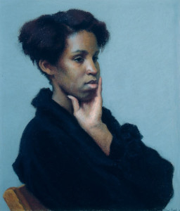
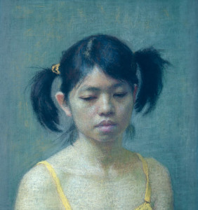
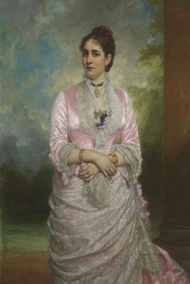
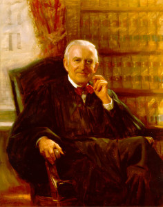
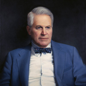
In portrait and figure painting in particular, success depends on the use of a wide range of translucencies in the paint because flesh as a whole, even from person to person, is a matter of degrees of translucency.
Transparency and Translucency
Color is nothing without light and to a large degree, controlling the effects of light gives us mastery over color. Even for those who choose the old master method of layering, the example of one layer of alla prima painting clearly demonstrates the roles that transparency and opacity play in the creation of quality coloring. Allowing light to pass through and distribute itself within the paint film, interacting with the pigment particles, and reflecting back to the viewer’s eyes is the essential role of transparent or translucent paint. Therefore, adjustments in the degree to which light passes through a paint film gives the artist control over that factor in the creation of rich coloring.
Each of the pigments has its degree of transparency or opacity and many of today’s paint manufacturers state on their labels the degree of either of those for each of their colors. Through experimentation an artist can find the appropriate combination of these two opposite qualities for a particular kind of artistic expression and level of richness. For example, a translucent zinc or flake white might require a more opaque color mixed with it than a titanium white would require. Or perhaps a mix of the opaque titanium and an opaque red oxide might be too opaque, when a mixture of titanium and the transparent burnt sienna could give just the right kind of translucency.
Painting Mediums
Another means of controlling the amount of light passing through a paint film is the paint medium. Artists who make their own paints have the maximum control over this factor, although few artists today are willing to go to that length in their craftsmanship. Instead artists add oils, spirits and resins (typically referred to as the artist’s medium) to the tubed commercial paint and this can have significant effects on the way light travels through the paint film. Adding more oil generally creates more transparency or translucency than less oil because it suspends the pigment particles in a thicker dried film allowing for more light activity within it. Using a thickened oil, like stand oil, which has been partially dried, creates an even deeper film that can affect our experience of color in a way similar to that of light coming to us from behind a thick piece of colored glass. We get from it a sense of what is described as “luminosity” in paint.
The addition of a natural resin (e.g. damar and copal) or synthetic resin (e.g. alkyd) to the medium can help to create that effect. Resins in general, whether used in the paint medium or on top of the paint film, help create a more level surface, an even gloss, which in turn helps in the way light enters the film and returns to our eyes.
A resin as a part of the medium also strengthens the film for the artist who prefers to paint in thin layers. The spirits or volatile solutions typically used in thinning paint evaporate after the paint has been spread out, adding nothing to the film, Consequently excessive reliance on spirits can leave the film weakened and vulnerable to cracking. Using resin with the mixture allows the paint to be used thinly yet maintain a substantial enough film to keep the pigment particles suspended for adequate play of light while minimizing the risk of cracking.
Final Varnish
Resin used as a final varnish, and used thickly enough, typically enhances a painting’s colors. Why is this so? Whether paint is laid down in a smooth or heavily textured way, the paint surface has microscopic bumps and hollows that fracture the light rays sending them off into different directions. Consequently less light goes deep into the film to carry color back to our eyes. A layer of varnish contributes to leveling out the surface of the painting so that the light rays enter and come back to us in a more uniform, less splintered way. Picture a rock on the beach which is moderately colored when it is dry but much deeper and richer in color when wet. The same principle is at work there. The water creates a more level covering over the rock’s surface, affecting the course of the light rays before they reach the uneven surface.
The Ground (Painting Surface)
The levelness of the ground (the prepared surface of the board or canvas) can contribute to the leveling of the painting’s surface, helping the light to travel more freely into the paint film and back again, relatively unobstructed, which in turn affects the quality of the color. Avoiding brush strokes when applying the primer and sanding between layers and after the final one can help in this respect.
The absorbency and porosity of the primed ground can also affect the final richness of color because an absorbent and/or porous ground can drink or pull the oil of the paint medium into the ground, substantially robbing the paint of its transparent film.
- For this reason an oil ground (less absorbent) is generally better than an acrylic gesso ground (more absorbent) for creating a richly colored oil painting. The traditional gessos, (marble dust and glue) were also too absorbent for oil painting unless an oil was added to the gesso.
- Porosity can be avoided by filling the crevices between the threads of a canvas surface thoroughly with glue and oil primer. Using a finely woven canvas can also be helpful.
- Working on a wood or hard board panel avoids much of the problem of porosity because it is a solid, flat surface without the depressions that exist between the threads of a canva
Composition
Armed with this knowledge of the technical aspects of creating rich color will have little effect without an accompanying sense of how colors relate to each other in a composition as a whole. Each color in a painting is perceived within the total arrangement— or simply put, everything is what it is in relation to everything else. A red dress in a white room for example is very different from a red dress in a black room or a purple room, or a purple grey room. The artistic judgment in this respect, again, comes down to an artist’s innate talent, experience at painting, and thoughtful study of works by artists who have been successful in this respect.
What constitutes a strong composition with regard to color? The color notes (independent passages of color and value, similar to notes in music) have to have adequate contrast but they must also complete each other in a way that gives us a sense of an interrelatedness or harmony— even when an element among them is intentionally dissonant. All of the colors in a painting should work together, as all the instrumental parts in a symphony work together, creating a resonant tapestry-like effect. In a successful painting no one color acts totally alone, even when there is a solo movement within it.
Summary
While simply replicating the color processes of more experienced artists can bring some success, knowing why some methods create rich colors and why some create dull, lifeless colors gives you, the artist, the resources to overcome obstacles to good coloring , better preparing you to create for yourself, and for others, an artistic expression that is rich, whole and life-affirming.
This article was published in International Artist magazine.