by Richard Halstead | Sep 3, 2015 | Artists' Struggles, Portrait Artists, The Tradition of Portrait Painting, Uncategorized
When I look at Ellen Eagle’s work I am reminded of my earliest interest in portraits. I was a boy, looking at reproductions of old masters’ paintings in my parents’ attic, moved by something immediately present about them but other world at the same time. Eagle’s works are like that. They are very specific to the individual sitter’s character and momentary presence, but larger yet— universal and timeless.
The famous teacher, Robert Henri once wrote: “There are moments in our lives, there are moments in a day, when we seem to see beyond the usual- become clairvoyant. We reach then into reality. Such are the moments of our greatest happiness. Such are the moments of our greatest wisdom. It is in the nature of all people to have these experiences; but in our time and under the conditions of our lives, it is only a rare few who are able to continue in the experience and find expression for it.” The Art Spirit
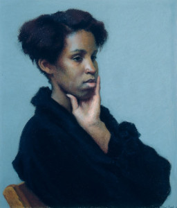
Andrea
14″ x 12-1/4″, Pastel
Eagle’s portraits are very different from Henri’s, but ironically they are the quintessence of that statement. They are so utterly real, so painfully everyday, and yet they are bathed in an ambient light that suggests her subjects are somehow blessed by an unseen presence.
I am drawn back to Eagle’s paintings whenever I grow tired of the affectations of so many contemporary portraitists. I am at first restored or refreshed by the honesty of her portrayals. Then as I study them more closely I find that little firings are going off in my brain that I can only describe as an experience of being repeatedly stunned by what she has accomplished within that quiet, unassuming presentation. Each small section is a new surprise with its own impact, yet each is perfectly integrated, so that a viewer can comfortably explore the face or figure without feeling lost or disconnected from the whole. Who would guess that there could be such subtly interwoven passages in the depiction of a single figure?
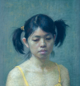
Mei-Chiao
6-1/2″ x 6-1/4″, Pastel
The people in her works, as well as her technique, are unashamedly earthy and plain but painted with the sensitivity and intricacy of a Chopin sonata. This intrinsic contrast is the basis of her power: contrast between that which is weighty and elemental, and that which is sensitive and refined; contrast between deeply felt emotion, even passion, and the restraint of discipline and thoughtfulness; contrast between the simplicity of a single figure and the complex arrangement of subtle movements within the figure and within the light and space that surrounds it. These contrasts fittingly engender both a sense of serenity and of being very much alive.
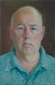
Maurice
8-1/8″ x 5-3/8″, Pastel
If you are put off by the homeliness of everyday life, you may not like her work. But if you are not, Eagle’s paintings will lead you to an even greater belief, than you may already have, in the survival of the human spirit. Her work gives us faith in that. Some of us, at various points in our lives, have questioned our ability to survive with our authentic vision intact. Eagle’s paintings suggest that she too has struggled, possibly stumbling and doubting herself now and then, but that she has tenaciously returned to that steady gaze at life as it is—-in all its quiet glory. Her works give the impression that they were made by an artist with heart, stubbornness, and conviction.
If any of you have seen her paintings and not had this feeling, I suggest that you visit them again sometime when you have a quieter mind. They require patience and receptivity. Eagle’s vision will not leap out at you. It is too dignified and worldly wise to demand your attention. It is not advertisement for the artist but rather an intimate conversation with a close friend. If you take the time to study her portraits you discover that you are in a privileged space, talking about the deepest experiences of your life, or hers or that of the subject of the portrait.
The Canadian author, Margaret Laurence was once quoted as saying that she wrote about what everyone knew but never thought to write about. In a similar way Ellen Eagle paints what we all see and typically disregard as insignificant. Tactfully and unobtrusively she slips around the shields that her sitters wear to protect them from the world and paints them in the safety of her world. By allowing us to see them in this way, in their least guarded moments, she confirms for us that what is genuine is ultimately the most beautiful.
by Richard | Dec 21, 2011 | Artists' Struggles, Color Mixing, Teaching Philosophy, Uncategorized
 All students who strive to create life-like portraits at some point ask me, “How do I create flesh tones?” So, when I recently had occasion to put my answer to this question in writing—having been asked it by a former student via e-mail—I thought it might make a useful blog posting. With her permission, I have posted this student’s e-mail to me (for context) and the relevant portion of my reply. As always, if you would like me to explain any of this more fully, my studio door is open to you—as is this blog.
It’s Susan Dillard. A blast from the past. Still living happily ever after in South Carolina. . . . I am writing because I’m really struggling with my flesh tone palette and I was hoping you might give me a little direction.
When I came here [to South Carolina] and beg[a]n studying with Jean Pilk, who had studied for years with Daniel Greene, [she] directed me to use a palette of Cadmium Red light with Yellow Ochre as a base. From that she would mix variations incorporating different levels of grey. I have always found this combination to be unnaturally red.
Next, I studied Sanden’s palette, which again used red light and yellow ochre but calmed it down with viridian, or chromium green, or cerulean blue. His palette variations for halftones etc are very complicated.
I did a workshop in North Carolina last year with Rich Nelson. He simply uses Burnt Sienna for flesh tones. Adding other colors too it. Whoa!
Recently I ran across a blog Marvin Mattelson whose style and color are similar t[o] the flesh tones I have seen you use in the studio (although I have never seen your palette). He has taken ALL cadmium out of his palette. His goal is to create “natural not electric skin tones.” Here is his theory,
“I was drawn to the flesh tones of William McGregor Paxton, who in my humble opinion was the greatest colorist of flesh. Paxton theorized if we come from dust and return to dust we should use dust (earth colors) when painting flesh.” He says, “it is almost impossible to paint a bad looking flesh tone if you approach it intelligently. My flesh colors are, Venetian Red, Indian Red, Yellow Ochre, Raw Umber, Ivory Black, and Flake White.”
He also uses in his palette Ultramarine Blue, Permanent Alizarin, Viridian Green also Michael Harding’s Naples Yellow and Michael Harding’s Vermillion. Plus, neutral greys.
This sounds like a great palette because I’m looking for more natural tones in my work. But I almost become frozen when I lay out a palette. Do I premix? What color are shadows? What am I doing? It’s very confusing.
Any suggestions? I have loved the colors in your portraits more than any I have seen and I would love to get your thought on flesh tone palettes or any book suggestions.
—Susan Dillard, October 9, 2011
Dear Blast from the Past,
. . . . I like what you said about Marvin Mattelson and his use of color. His palette probably is not very different from mine. Pilk has a fairly decent idea with the gray but she would have very little variation because she has only one red and that one is not versatile. Nelson’s approach sounds limiting. Sanden is very efficient, obviously with all the commission work he does, but too systematic for me with all that premixing. I do think a really fine painting with fine flesh colors can be done with Mattelson’s palette.
A few thoughts:
1. The white factor. The richness, vibrancy or saturation of a color is always diminished and made cooler by the addition of white, especially a cool white like titanium. That’s why you always have to make a completely different mix from the light area to the middle tone area to the darks. Burnt umber in the darks could be too hot but stone cold gray in the lights.
2. The transparency or opacity of a pigment has a lot to do with its quality of color and that can differ quite a lot from one pigment to the other. You have to experiment to find exactly the right kind of transparency or opacity for representing a particular color in nature, and to do that you have to put together pigments with the right combination of those things in the right proportions, i.e., if you use the translucent white flake for flesh it might be better to use a more opaque yellow like Naples and if you use a more opaque white like titanium it might be better to use a semi-translucent yellow like yellow ochre.
3. Every basic color should have a pigment on either side of it. Red should have an orange side like cad. red light, and one on the purple side like alizarin. In the earth colors the same thing: Venetian red or burnt sienna on the orange side and Indian red on the purple side. Flesh colors are difficult because they are so subtle. So the trick really is in knowing how to get yourself in the ball park, or to a general color that is close, and then to tip it this way and that, on either side of the hypothetical middle color, red or yellow or green or blue, and so on until it falls into place just where you want it. There is no way around that. No simple silver bullet.
4. Variations of the colors, sometimes beyond the perfectly real and natural, make flesh seem alive and lively. That could be just the very subtle differences in a reddish beige color that shifts slightly from a more orange type to a more purplish type. In the cool areas the same idea applies: a beige or brownish that shifts a little toward green here and blue or purplish there might do the trick. The face has natural areas that differ in color that way but you can make the lights, darks, and middles tip in different directions to accomplish that too. Between those areas you can shift the colors subtly from warms to cools to warms to cools.
—Richard Halstead, October 10, 2011
by Richard | Dec 7, 2011 | Andrew Wyeth, Artists' Struggles, N. C. Wyeth
There were three artists in the Wyeth family. The first was N.C. (Newell Convers) Wyeth, the second, Andrew Wyeth, and the third, James Wyeth who is the only one still living.

N.C. Wyeth illustration from Treasure Island
N.C. was very famous in his time and is still well known for his powerful, dramatic, operatic illustrations of adventure books and stories. His figures are heroic in proportions and always give the appearance of at least having a potential for violence. Solidly but simply constructed, they are made with little detail, yet the thick use of paint simulates the busy textures of nature, contributing to the dynamic quality of his work.
Andrew Wyeth was one of the best known artists in the country and is still well known for his quiet, austere, haunting images of people and scenes normally overlooked in the general scheme of life. (See http://www.andrewwyeth.com/index.html) His paintings are contemplative and they often have a sense of timelessness which is alternately unsettling and comforting. This effect was accomplished by a delicate balance between highly rendered details and compositional simplicity and by using form as means of creating subtle lighting effects that in turn created their special moods.
N.C. died with his grandson in a car-train accident. There has been speculation that the death was suicide possibly because of a bi-polar condition and ongoing angst over his unfulfilled attempts at bringing his work to a higher level.
Andrew Wyeth seemed to pity his father’s loss of faith in his own natural talents and for his attempts at creating work that was opposite that nature. But Ironically Andrew made the same mistake in reverse. N.C. dismissed the unique power in his dramatic illustrations and tried to create work that expressed the infinite and universal in the small and mundane aspects of life. In a similar manner Andrew gave less credence to the quiet timelessness in his paintings and more to a powerful force that he preferred to believe was emanating from them.
I think both men were more honest with themselves when they were young than when they were in their later years—truer to themselves before they began to judge themselves against all they admired in life, and in each other.
When N.C. was a young illustrator and doing research for illustrations on the western plains of the U.S. he wrote home about how life there “clutches me like some unseen animal.” Later in his life he wrote “The significance of a tiny speck of bark on the pine tree assumes the proportions of the infinite sky”—words that better describe his son’s work than his own.
Andrew said, by way of describing Rembrandt’s paintings, “His people turn toward the light. but it’s frozen motion; time is holding its breath for an instant—for an eternity. That’s what I’m after.” But later, when the quality of his work had declined he spoke as if his paintings were charged with heightened emotions, using words like anger and intensity, which better describe his father’s work.
The loss of self is not unusual among artists. A consciousness of self expression is a relatively new requirement in the history of art and is, I think, one of the primary difficulties for artists today. Until the19th century it was a secondary concern. Finding one’s self and creating an effective means of expression that meets the present sense of art’s function is often a mirage-like experience. The more deliberate we are about it the more it seems to slip away form us. That is the most difficult lesson to learn in creating art and the most difficult puzzle to solve.
